The long wait is over and the new jerseys are out just in time for training camp. Call me crazy...but I like them. As announced, they're simple and don't really stray from the original design. The striping isn't overdone, the front of the jersey doesn't feel cramped (see Canucks, Vancouver) and the foot patches have been retained. I love the yeti foot.
Thumbnail shots from the Avalanche.com Media Gallery section are below so you can see them in all their glory. Or all their gory. Whichever side of the liking it/hating it coin you fall on. I think the away jerseys are easier to like than the home jerseys.


Here is the Denver Post coverage. Thanks to Selanne for the link. (No, not that Selanne)
http://www.denverpost.com/sports/ci_6872435
So how does this compare to the best concept jersey? Of all I've seen, a good chunk which are represented in the Picasa Web Concept Album, the one I preferred and hoped was closest to the real thing was this one:
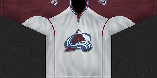
So the yeti foot stays, but there is more piping than I would have hoped for. I can't say I won't be purchasing one though.
For a full list of officially released jerseys, visit the NHL Logo Picasa Web Gallery created by Chris from nhllogos.blogspot.com.
And while you're there, don't forget to vote for the Avalanche logo. Unless you prefer the oil slick. And nobody prefers oil slicks. Especially baby seals. So a vote for the Oilers logo is a vote against baby seals. Won't somebody think of the seal children!


